Celebrity Alphabet
Celebrity Alphabet
Graphic Design III: Advanced with Debra Glass
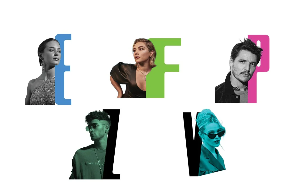
In this project, I explored forms that can exist between letters and matching figures. Given the categories, celebrities, emotions, and animals, I developed a list of figures that aligned with each letter of the alphabet (ex. A= Anthony Mackie, Angry, Anteater; B= Beyonce, Baffled, Buffalo, and so on). I went on to choose the strongest category- which was celebrities in my case- and refined it until I had a full cohesive set of visually compelling forms.
Ideation
In the ideation phase of this project, I began by writing down several key words and sketching rough drawings of the concepts I might explore for each category. Having plenty of options early on is an important factor in creating a great design.
Next, I chose one rough drawing for each category that I liked the most and refined it digitally. From this set of drafts, I decided to move forward with the celebrities category.
I chose the celebrities I wanted to use- originally a mix of historical figures and pop culture icons- and quickly drafted each one. As I got deeper into the project, though, my direction shifted slightly and many of the faces I used changed to follow a more cohesive theme.
Then, I went to Pinterest and Google to find the perfect images of my celebrities and used Photoshop to create each composition.
Design Process
To make my alphabet work, I knew that I needed to find a sans serif typeface that was condensed and didn’t use wide angles or curves. Fortunately, I didn't have to look long before discovering the perfect one: Jetlab from Swell Type. I paired letters with each figure and moved on to color, exploring different ways to integrate it into the design.
I was having trouble picking the right colors so I made a moodboard of other posters from Pinterest that had caught my eye. During my initial research for this alphabet, I was inspired by maximalist posters that utilized the style of anti-design. I found this style particularly fitting for the celebrity theme, as many famous people tend to appear out-of-touch and pompous at times, despite having adoring fans. I drew a parallel between this phenomenon and the principles of anti-design which prioritize rejecting norms and critiquing dominant culture trends.
From there, I developed three potential color palettes. Because I planned to use a simple white background, I incorporated bright colors to avoid a minimalist approach and instead include this eye-catching theme of anti-design.
However, I found that none of the color palettes were the right fit for my project. I realized that the issue was the overwhelming amount of colors I was using, which made the composition busy and distracting in the wrong way. In an attempt to simplify, I experimented with only one color; but this approach lacked the visual intensity I was looking for. I then revisited the moodboard I’d made earlier and tried again, this time using just two colors.
Results
Finally, I had the perfect color palette. I arranged the figures in my desired layout, applying color as the final step. My goal was to achieve a sense of randomness in the placement of color while maintaining a balanced and aesthetically pleasing design. After hours of work, I was pleased with the final result: a full alphabet of bold celebrity forms that effectively incorporated the principles of anti-design.


